Geology and Election 2000: Overview
Steven Dutch, Professor Emeritus, Natural and Applied Sciences,Universityof Wisconsin - Green Bay
This site has a large number of supporting graphics. This page presents an overview. Click the links to view the supporting graphics in more detail.
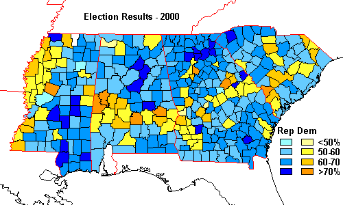
On the map of electoral returns for the presidential election of 2000 is a feature instantly recognizable to a geologist: in the otherwise pro-Bush South,an arcuate band of pro-Gore counties sweeps from eastern Mississippi, across Alabama and Georgia and into the Carolinas
My geologist's eye was immediately drawn to this arc because it coincides almost exactly with a series of rock units on the Geologic Map of the United States. Why would election returns follow rock outcrops?
In the map below, Cretaceous rock units (139-65 million years old) are shown in shades of green. Older rock units are in gray, younger ones in yellow. The complex NE-trending patterns in Alabama, Georgia and South Carolina are deformedrocks of the Appalachians. In NW Alabama, the older rocks are flat-lying layersof the continental interior.
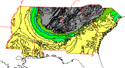
Comparison with the geologic maps shows that the arc actually consists ofthree segments.
- In Mississippi and Alabama the pro-Gore band of countiescorresponds very closely with the units labeled uK - upper Cretaceous. We might suspect that the most likely explanation for this part of the arc has to do with economic patterns dictated by the soils. Most of the electoral and demographic patterns associated with the band end abruptly in NE Mississippi.
- In Georgia, the Cretaceous outcrop band is very narrow. It is surprising how clear the pro-Gore band is in Georgia considering how narrow and discontinuous theoutcrop band of Cretaceous rocks is. This part of the arc may have less to do with the rocks themselves than the boundary between the Appalachians and the Coastal Plain.
- In South Carolina, however, the band of Democratic counties is well defined but is consistently seaward of the Cretaceous rock units. Infact, on some maps there seems to be a weak anti-correlation between the Cretaceous rocks in South Carolina and the political and demographic trends noted for the other three states. However, the South Carolina portion of the arc turns out to be consistent in election returns and a variety of other demographic factors.
This band shows up with varying degrees of prominence for previouselections as well. It shows the same correlation with rock units in Mississippi,Alabama and Georgia and the same lack of correlation in South Carolina. Itfurther shows strong correlation with demographic trends.
The Coastal plain rocks slope gently seaward toward the Gulf and Atlanticcoasts, a structure called a homocline. I therefore propose to call thearc of pro-Democratic counties, which is reflected in a variety of demographictrends, the Cretaceous Homoclinal Arc of Demography, which can be abbreviated byan acronym that more than anything else symbolizes the election of 2000: CHAD.
Demographics
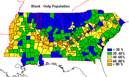 | Given the electoral patterns, the demographic trends of the region are very understandable. There is a pronounced arc of black population. Note that the band follows the Cretaceous rocks from Mississippi to Georgia but, like electoral trends, lies seaward of the band in South Carolina. |
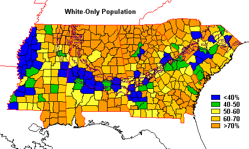 | The white population is essentially a mirror image of the black map. |
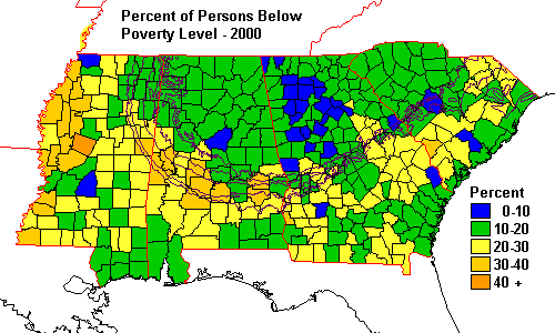 | And the arc shows up as a diffuse, somewhat broken band of high poverty. |
We can now understand why the arc is missing from the 1964 electoral map.1964 was the last Presidential election before the civil rights reforms of the1960's took effect, and the lack of any signature on the 1964 map reflects thesystematic exclusion of black voters.
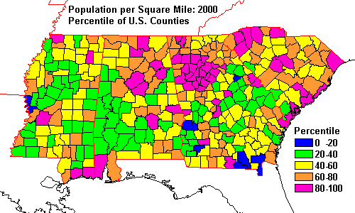
Most other demographic data, such as population density, show weak or nocorrelation with the belt.
View Demographic Data in Detail
Why Geology?
The connection between electoral and demographic patterns we see above is easy to understand.Much less obvious is why they should correlate with a particular set of rockunits. The rock units are not particularly rich in resources and differ littlefrom adjacent units. And why is there a continuous band of trends across fourstates but a geologic correlation in only three of them?
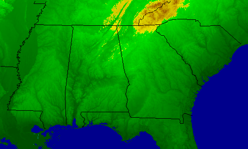 | The arc correlates in part with low elevations |
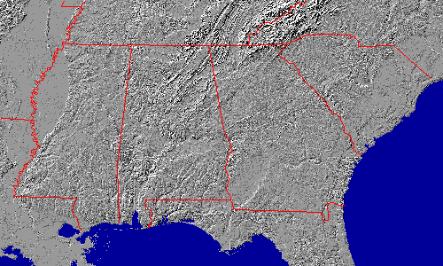 | The arc also correlates in part with a band of low relief. However, neither the elevations nor the relief offer any obvious explanation for the political and demographic patterns. |
The most obvious candidate for a causative factor is soils and agriculturalproductivity. Most of the soils of the arc are vertisols, and the soil belt iscalled the Black Belt or Blackland Prairie in Alabama and Mississippi. The belthas higher than average grass cover, lower than average forest cover, but nodramatically different patterns of crop production or productivity. A recent mapof U.S. soil productivity shows above-average soil productivity in this belt.
Land Use and Economics
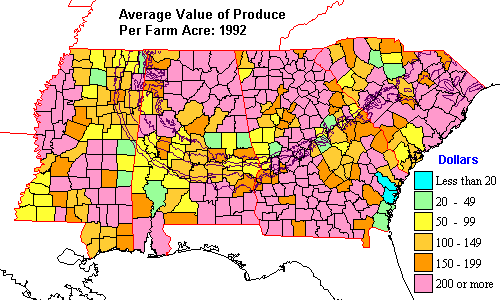 | A map of agricultural productivity doesn't reveal much. Part of the band is evident in Alabama as a bend of lower than average productivity, but the band has a wide gap in Georgia and is not evident in South Carolina. |
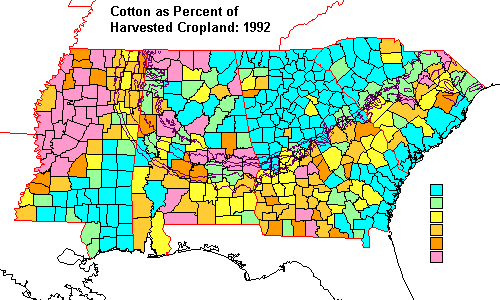 | We might suspect a correlation between cotton farming and the Democratic band, and while it is evident, there are other equally important cotton producing areas that were not pro-Gore in 2000. |
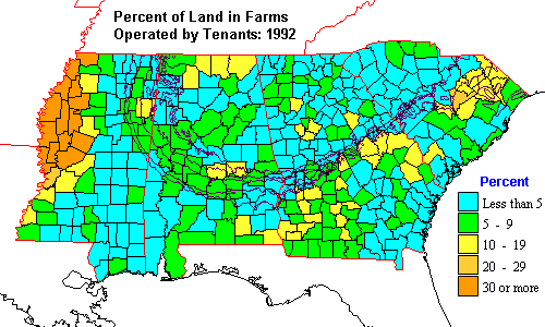 | Is there a connection between the pro-Gore band and that stereotypical Southern practice, tenant farming? Weak at best. In fact, surprisingly, the prevalence of tenant farming in the South is lower than the national average. |
View land use and economic data in detail.
The Past is the Key to the Present
If present-day factors don't clearly explain the band, then they must haveorigins farther back in history. Let's examine some historical data. We mightsurmise that the spread of cotton farming and slavery might explain thedemographic patterns, so let's start there.
Geology and Election 2000: Election Returns
Geology and Election 2000: History
Geology and Election 2000: Economics and Land Use
Geology and Election 2000: Demographics
Geology and Election 2000: Conclusions
Return to Professor Dutch's Home Page
Created 23 January 2002, Last Update 24 May 2020